TINY TALES
“ Helping parents discover the right stories for meaningful reading time with their children.”

TINY TALES
“ Helping parents discover the right stories for meaningful reading time with their children.”
Tiny Tales is a tablet-based story discovery experience that helps parents quickly find engaging, age-appropriate stories to read with their children.
As Tiny Tales’ story library grows, parents need a faster and easier way to find stories that match their children’s interests and needs.
Create an intuitive tablet experience that helps parents discover engaging stories without spending unnecessary time searching.
I designed and tested a story discovery experience that organizes content around meaningful categories and gives parents clearer ways to browse and choose what to read.
Parents can browse and filter stories by relevant criteria, helping them find suitable content without searching through an overwhelming library.
Stories are organized to help parents quickly identify content that fits their child’s age and interests, making the selection process more intuitive.
The experience keeps discovery and reading within one simple flow, reducing unnecessary steps between finding a story and reading it with a child.


Day 1
Understand
Define the problem and map the user journey

Parents want reading time to feel meaningful, but finding the right story can take too much time. The research highlighted a need for a simpler way to discover stories based on a child’s age, interests, and reading needs.
I synthesized insights from user research to identify recurring needs and frustrations. These findings helped me focus the design on faster story discovery, clearer content organization, and helping parents feel more confident when choosing what to read.

Based on the research insights, I reframed the key user needs as “How Might We” questions to guide ideation and keep potential solutions focused on parents’ most important challenges.

I mapped the core user flow to translate research insights into a clear story-discovery experience. The flow prioritizes filtering by age, story length, and topic, helping parents move quickly from browsing to selecting and reading a story.

Day 2 Ideate
Explore possible solutions through competitive research and rapid sketching
COMPETITIVE RESEARCH — VOOKS
I reviewed Vooks to understand how an existing children’s reading product organizes and presents a large story library. I focused on content discovery, categorization, story length, and the information parents receive before choosing a story.

Competitive research helped me identify both useful patterns and opportunities to improve story discovery. Existing products made it easy to browse content, but important decision-making information—such as age, topic, and user feedback—was not always easy to access. These findings influenced the filtering and discovery features I explored for Tiny Tales.
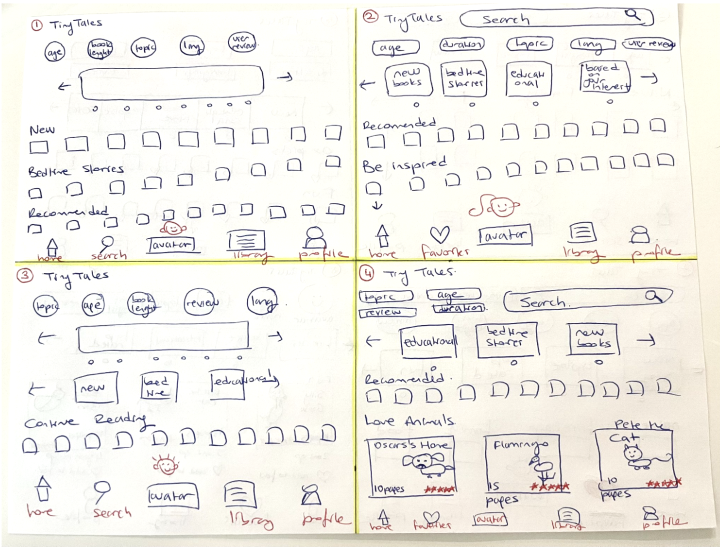

I used Crazy 8s to quickly explore multiple approaches to story discovery and content organization. This exercise helped me compare different layouts, filtering options, and navigation patterns before selecting the strongest direction to develop further.
I developed the strongest concept into a three-panel flow focused on the key moment in the story discovery experience.


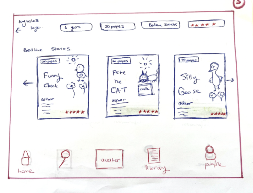
DISCOVER
Browse stories and explore content categories.
FILTER & CHOOSE
Narrow results by age, duration, topic, and reviews.
EXPLORE A STORY
Review story details before deciding what to read.
Day 3 Storyboard
Select a direction & map the end-to-end experience


I expanded the selected solution into an 11-panel storyboard, mapping the key steps from discovering a story to reading it. This helped me define the core experience and identify the interactions I needed to prototype and test.
Day 4 Prototype
Turn the selected concept into a testable experience


I translated the storyboard into a high-fidelity, interactive prototype focused on helping parents find the right story quickly. I designed filters for age, reading time, topic, and reviews based on the needs identified during research.
These filters reduce the effort required to browse a large library while giving parents more confidence that a story fits their child’s age, interests, and available reading time.
Day 5 Usability Testing
Test the prototype, identify usability issues & iterate

I conducted usability tests with five participants using the Five-Act Interview method to understand how easily parents could discover stories that matched their needs.
The testing focused on three key questions:
Can parents find an appropriate story quickly?
Can they easily discover stories by topic?
Can they identify stories that balance entertainment and educational value?

Parents had difficulty visually distinguishing between content sections on the home screen.
I introduced distinct section colors and increased text contrast to create clearer visual hierarchy and make content easier to scan.

Parents found individual reading-time options difficult to scan and preferred broader time ranges.
I grouped reading times into ranges such as 5–10 and 10–15 minutes, making the duration filter faster and easier to use.

Users were confused when the avatar became smaller after selection, making the active state difficult to recognize.
I increased the avatar size and added a contrasting background to make the selected state more noticeable and consistent.
OUTCOME
Usability testing revealed three key friction points in navigation, filtering, and visual feedback. I used these findings to refine the interface and make story discovery clearer, faster, and easier for parents.